Example Page

This page is an example of all the recommended components to use the Heelium theme in conjunction with the School of Ed branding.
Sed ut perspiciatis unde omnis iste natus error sit voluptatem accusantium doloremque laudantium, totam rem aperiam, eaque ipsa quae ab illo inventore veritatis et quasi architecto beatae vitae dicta sunt explicabo.
Nemo enim ipsam voluptatem quia voluptas sit aspernatur aut odit aut fugit, sed quia consequuntur magni dolores eos qui ratione voluptatem sequi nesciunt.
Standard Styles
For your basic text style, use the top row of the toolbar.
Images

To insert images, click the “Add Media” button immediately above the toolbar. To change the size, orientation, and/or caption for an image, click on the image and select the pencil edit icon and update the display settings.
To add a full-width image (like the one at the top of this page), after adding the media to the post, click on the image and select the pencil/edit icon. In display settings, select “center” under alignment and “full size” for media size. (When uploading your image, be sure to select one that is sufficiently wide enough in dimensions, approx. 1200-2,000 pixels, to display well.)
Lists
Unordered lists look something like this:
- Neque porro quisquam est,
- qui dolorem ipsum quia dolor sit amet,
- consectetur, adipisci velit.
And unordered lists like so:
- Quia non numquam
- eius modi tempora incidunt ut
- Labore et dolore magnam aliquam quaerat voluptatem.
Headers
To add a header to your text, click on the first drop-down in the toolbar and select a heading style. (To change your text back into normal text, highlight it and select Paragraph.)
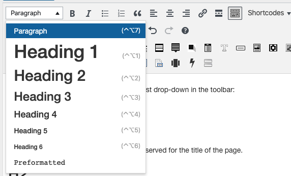
H1
Don’t use this one. It’s a special heading reserved for the title of the page.
H2
Your primary heading style on the page
H3
For subheadings under an H2
H4
For subheadings under and H3
H5
For subheadings under an H4
H6
For subheading under an H5
Well Shortcode
Example

Heading for this box
Nulla vitae elit libero, a pharetra augue. Donec ullamcorper nulla non metus auctor fringilla. Cras justo odio, dapibus ac facilisis in, egestas eget quam. Nullam id dolor id nibh ultricies vehicula ut id elit. Praesent commodo cursus magna, vel scelerisque nisl consectetur et.
Vivamus sagittis lacus vel augue laoreet rutrum faucibus dolor auctor. Praesent commodo cursus magna, vel scelerisque nisl consectetur et. Duis mollis, est non commodo luctus, nisi erat porttitor ligula, eget lacinia odio sem nec elit. Nulla vitae elit libero, a pharetra augue.
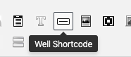
Instructions
To add, click on the well shortcode icon found in the 3rd row of the toolbar (roughly in the middle):
Full Width Box
Use this to call out key information or at the top of a page as an introduction to the rest of the page.
Example
 Header within the box

Nullam id dolor id nibh ultricies vehicula ut id elit. Sed posuere consectetur est at lobortis. Donec ullamcorper nulla non metus auctor fringilla. Sed posuere consectetur est at lobortis. Nulla vitae elit libero, a pharetra augue. Donec ullamcorper nulla non metus auctor fringilla. Maecenas sed diam eget risus varius blandit sit amet non magna.
Cras mattis consectetur purus sit amet fermentum. Donec id elit non mi porta gravida at eget metus. Nullam id dolor id nibh ultricies vehicula ut id elit. Maecenas faucibus mollis interdum. Maecenas sed diam eget risus varius blandit sit amet non magna. Nullam quis risus eget urna mollis ornare vel eu leo.
Sed posuere consectetur est at lobortis. Vestibulum id ligula porta felis euismod semper. Fusce dapibus, tellus ac cursus commodo, tortor mauris condimentum nibh, ut fermentum massa justo sit amet risus. Nulla vitae elit libero, a pharetra augue. Morbi leo risus, porta ac consectetur ac, vestibulum at eros.
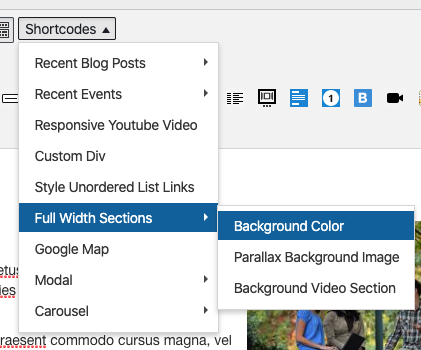
Instructions
To add,
- Select the full-width component > background color in the shortcodes drop-down on the 1st row of the toolbar:

- Insert the following color in between the quotes for the “background color: #E4F0F9.
Accordions
Use these when you have long procedure content or several options for special cases that only apply to a subset of people using the page—e.g., special contact information for a particular audience.
Example
Instructions
To add, click on the toggle/accordion shortcode found in the 3rd row of the toolbar (at the beginning):

Columns
Use for link collections or to lay out long lists of links.
Example

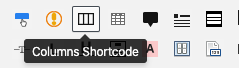
Instructions
To add columns, click on the columns shortcode found in the 3rd row of the toolbar (near the beginning):
Video
Use for videos. (Upload to YouTube first.)
Example
Instructions
- Before you begin, make sure your video is available on YouTube.
- Select the responsive youtube video option from the shortcodes dropdown found in the first row of the toolbar.
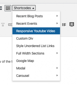
- Navigate to the video on Youtube. Click the Share button just below the video. Copy the last part of the URL. That is the ID number.
- Paste your video’s ID number in between the quotes in the shortcode. Your ID should look something like TbTpbh5irvA. Do not include the URL.

Recent Blog Posts
Example
-
Hello world!
Welcome to web.unc.edu. This is just a sample post. Edit or delete it, and start building your site!
Instructions
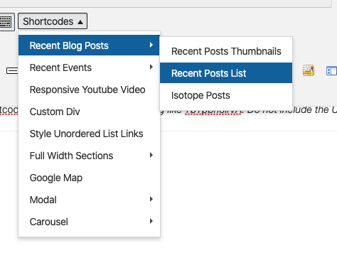
To add, select Recent Blog Posts > Recent Posts List from the shortcodes drop-down in the first row of the toolbar:
Recent Blog Posts Thumbnails
Example
Hello world!
Welcome to web.unc.edu. This is just a sample post. Edit or delete it, and start building your site!
Instructions
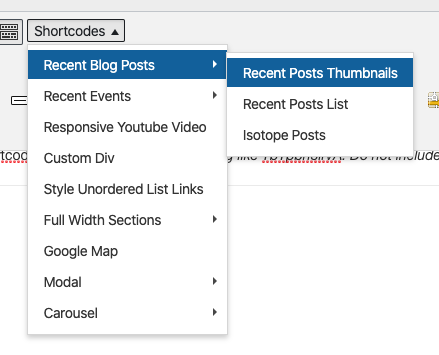
To add, select Recent Blog Posts > Recent Posts Thumbnails from the shortcodes drop-down in the first row of the toolbar:
Panels
Use these to call out key information, like a deadline or registration link.
Example
Panel: Default (Gray)
Panel: Primary (Blue)
Panel: Success (Green)
Panel: Info (Blue)
Panel: Danger (Red)
Instructions
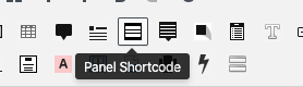
Select the panel shortcode in the 3rd row of the toolbar:
(Please note: do not use the “warning” panel style; it has low color contrast.)
Table
Use only for comparative and/or tabular data— not layout. Tables can be difficult for those using screenreaders. Refer to the W3 tutorial for help in using tables.
Example
[table width =”100%” style =”” responsive =”false”] [table_head] [th_column]Heading-1[/th_column] [th_column]Heading-2[/th_column] [th_column]Heading-3[/th_column] [th_column]Heading-4[/th_column] [/table_head] [table_body] [table_row] [row_column]Value-1[/row_column] [row_column]Value-2[/row_column] [row_column]Value-3[/row_column] [row_column]Value-4[/row_column] [/table_row] [table_row] [row_column]Value-1[/row_column] [row_column]Value-2[/row_column] [row_column]Value-3[/row_column] [row_column]Value-4[/row_column] [/table_row] [table_row] [row_column]Value-1[/row_column] [row_column]Value-2[/row_column] [row_column]Value-3[/row_column] [row_column]Value-4[/row_column] [/table_row] [table_row] [row_column]Value-1[/row_column] [row_column]Value-2[/row_column] [row_column]Value-3[/row_column] [row_column]Value-4[/row_column] [/table_row] [/table_body] [/table]Instructions
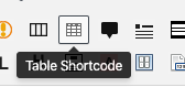
To add, click the table shortcode icon in the 3rd row of the toolbar (close to the beginning).
About the Toolbar
If you only see one row in your toolbar, click the toggle toolbar icon:
